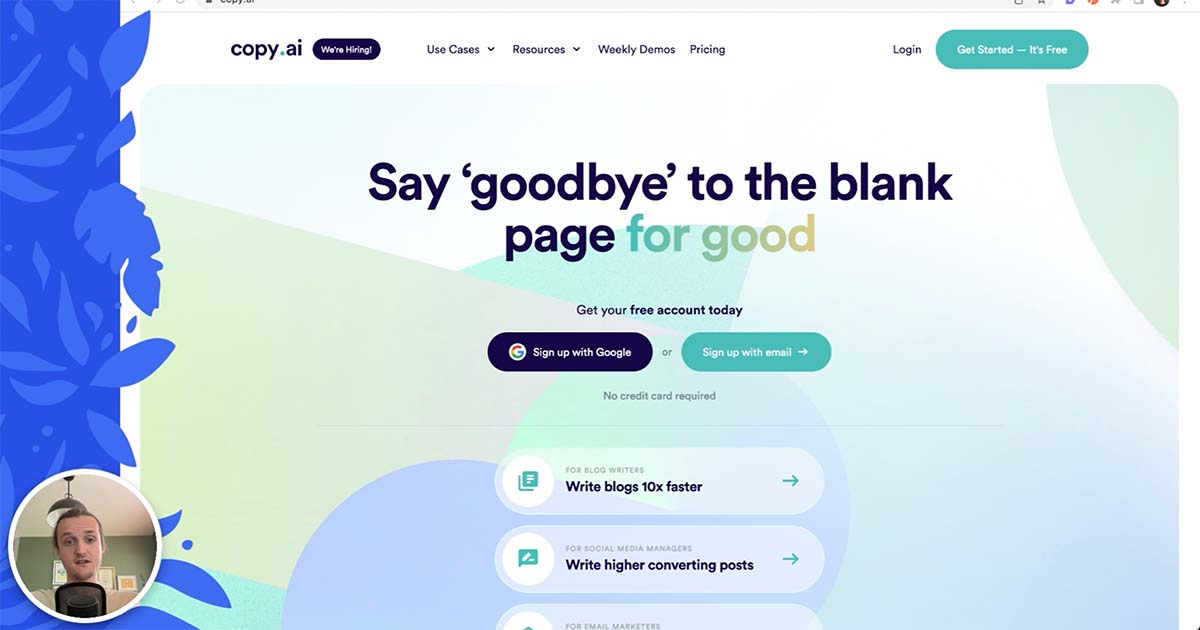
Copy.ai recently released their new website, which they built entirely using Webflow.
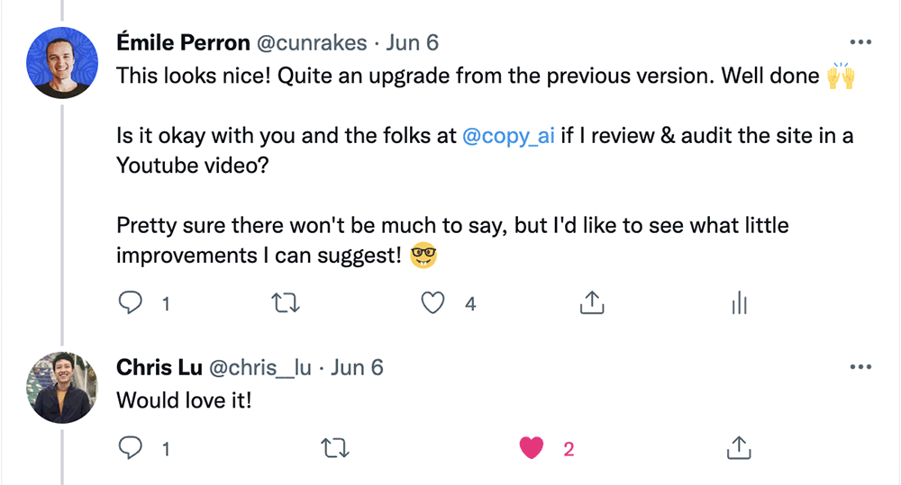
When I learned about this, I reached out to their team on Twitter. They agreed to let me audit their new site and publish the results, so I was excited to see what a quick quality control session would unveil.
In this article, we'll explore what their new website does right, but mostly we'll dive into the things that could be improved to make the site even better.
Let's get started!
Loading speed
First things first, you know we have to start with the site's loading speed.
Truth is, there's very little to be said about it: the site is fast. Even my slow home internet manages to load the homepage in less than a second, and that's saying something.
However, nothing is ever perfect in the land of optimizations, and this site is no exception. There are two areas where improvements could be made for loading speeds.
Large, unoptimized images
A quick look at Koalati's results for its automated loading speed tests shows that Copy.ai's blog articles often contain very large images. Like 1MB+ huge.
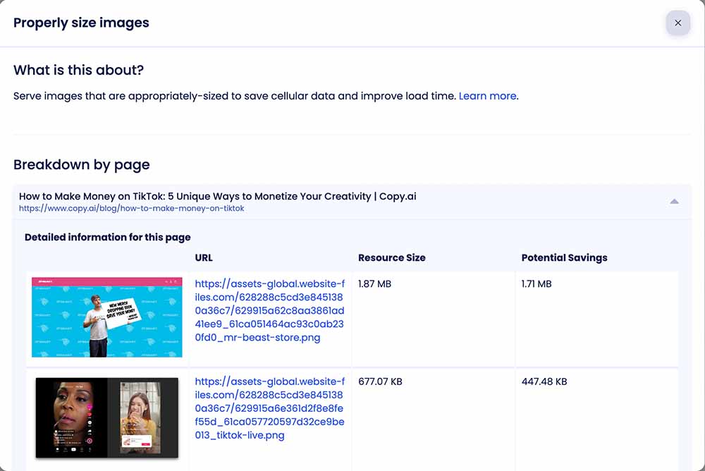
The first blog article I opened from the list took me 3.73s to load. That's not so bad compared to many other websites, but considering the fact that other pages load in less than a second, this feels rather slow in comparison.
How to improve large images
To fix this, the folks at Copy.ai will likely want to:
- Resize the images to an appropriate resolution.
- Optimize the images as much as possible (I like using Photoshop's export feature, and then running the images through Optimage for even more savings).
- Lazy-load the images in the article.
That last point is optional, and will likely depend on the location of the images within the article, but lazy-loading would likely be a good default for any images that are within the article's content.
However, I expect this last part isn't realistically doable for them. If I had to guess, I would say their articles are likely built within a Webflow collection, and images within a collection's Rich Text field cannot be lazy-loaded at the moment. It's a known limitation of the platform.
Still, even if they forego the lazy-loading, resizing and optimizing the images would be an impactful change.
Unused Javascript
Once again, a quick look at Koalati's automated loading speed test results tells the story of many different data-collection scripts.
Facebook, Fullstory, Hotjar, Segment and GTM all have their scripts included on most of the pages.
In total, that's 332.75 KB of scripts that don't add any direct value to the visitors and their experience on the site. Add that to the 22 KB script that handles cookie consent for this first batch of trackers, and you've got 350 KB of Javascript that has to be loaded and parsed.
Obviously, these scripts are cached by the browser after the first page load, but still. That's 350 KB of scripts that add nothing to the page.
How to reduce unused Javascript
If you've read our previous articles on analytics usage and on cookie consent banners, you probably know what our suggestion is gonna be for this one: ditch as many of these scripts and trackers as you can!
Not only would this be good for your loading speed and page weight, but it also reduces concerns around privacy for your visitors.
Broken links
Following Koalati's checklist lead us to look for broken links on the website.
A quick scan of the entire site using a free link checking tool rewarded us with a list of links that didn't work:
Links leading to internal 404 pages:
Links leading to empty anchors:
- Article titles in the "More articles" section of blog articles
Invalid link URL:
Links leading to external 404 pages
These are not as bad, but could potentially be fixed or removed.
- "STIL"
- "Image source"
- "Namechk"
Broken / laggy on Safari
Strangely enough, the entire website is seemingly broken and/or incredibly laggy on Safari, both on iOS and MacOS.
I haven't identified what is causing the issue, but:
- the site is much slower to load;
- the site loads and appears in chunks;
- once loaded, scrolling through the site causes flashes of blank white sections;
It even temporarily stalled Safari on MacOS for a while during my first attempt at recording it.
Once again, I'm not sure what the source of the issue may be, but this seems to be a fairly serious issue, which I managed to reproduce without any special steps on:
- an M1 Pro (2021) MacBook Pro, on MacOS Monterey;
- an iPhone 11, on iOS 15.3;
- an iPad Pro, controlled via Browserstack.
Accessibility
Accessibility is an aspect that is often neglected in web development.
In this case, although some things have been done correctly, there are still a few important accessibility issues that should be resolved.
Keyboard navigation
The site relies on the browser's default outline for targeted elements, and even disables that outline in a few locations (ex.: the main navigation's dropdown menus). In many cases, the default outline isn't very visible and could be improved upon.
Additionally, the accordions in the Contact page cannot be targeted with the keyboard. So if you use a keyboard (or any assistive technology, as we'll see below), you are ship out of luck (to be polite).
Non-semantic elements
The accordions on the Contact page come to mind again here: they're all divs. There's no aria attribute to assign them meaning. No tabindex attribute to provide focusability. Nada.
There's also no <header>, no <footer>, no <section>, <main> or <article>, in any pages (that I've seen).
This is not uncommon for a Webflow website, as the platform uses <div> by default and doesn't necessarily entice users to pick an adequate semantic element instead.
Still, seeing as Webflow does offer the option of changing the type of most elements, this is an area where Copy.ai could improve their site's accessibility in just a few clicks!
Color contrast
Overall, the website does a good job of using adequate levels of contrasts for the text content.
There are a few elements where the contrast is a bit too low according to current standards, but they're not far off. I suspect these elements will be considered accessible in upcoming standards (ex.: using APCA instead of WCAG 2's current calculations).
Although that speculation remains to be confirmed, I believe the other issues that have been discussed outshine this one, so I wouldn't spend much time on it until the basics are covered.
Alternative text for images
Many of the images on the website have alternative descriptions, which is good.
There is one location where this could be improved, and it's for the social media share buttons of the blog post pages. These buttons are links which contain an image (the icon of the social media platform). The link has a "title" attribute to provide context, but the images don't have an alt attribute. The title should likely be removed and defined as an alternative description on the <img> element instead.
I also noticed while looking at this that there are hidden buttons for social sharing as well in this section, which could probably be removed.
Heading hierarchy
Once again, most pages on Copy.ai's website do a good at following a logical heading hierarchy, where the page has a single <h1>, followed by sections with their <h2> titles and <h3> subtitles.
However, there are a few minor mistakes and questionable choices that could be fixed.
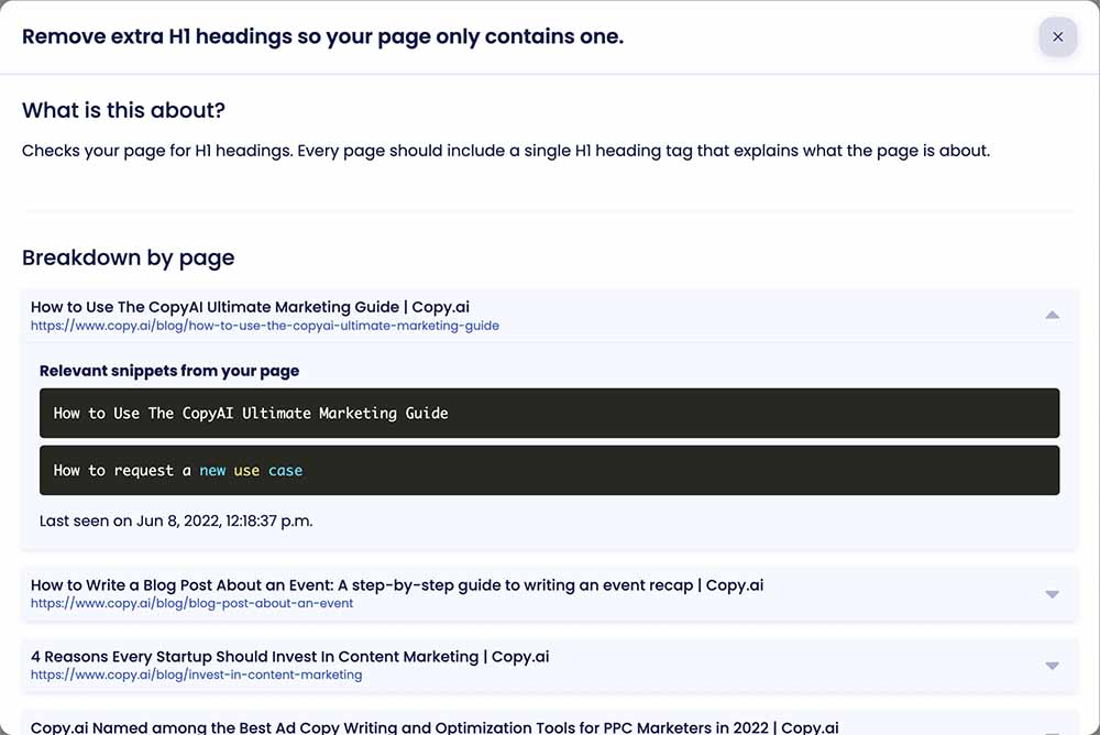
Duplicate <h1> headings
There are just over a dozen pages - mostly free tools and blog article pages - in which there are duplicate <h1> headings.
Each page should only have one H1 heading, which describes the subject of said page.
Removing the duplicates or switching to H2 headings would likely be a valid solution for these.
Author name as an <h2>
The author's name at the beginning of a blog post is defined as an <h2> heading, but this is a questionable choice.
In my understanding of the standards and best practices, the author's name should not use a heading at all in this scenario.
Instead, an author link type (<a rel="author" href="...">) could be used to provide context as to what the element is and what it links to.
Here is a short StackOverflow answer that describes how to best format this type of data for an article. It also provides information about the other semantic elements that surround it, so it will likely be helpful to improve the general accessibility of blog posts.
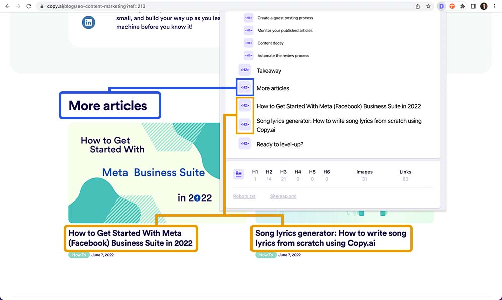
Article titles in "More articles" as <h2>
The "More articles" section at the end of a blog post uses an <h2> for its "More articles" heading, and then also uses <h2> headings for the titles of the articles it lists.
For the hierarchy to make sense here, the article titles should use an <h3> heading instead.
Other minor issues
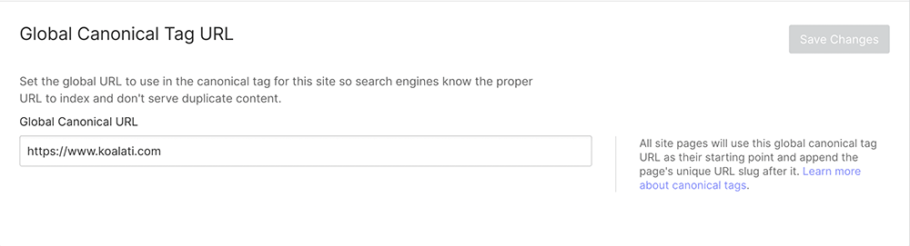
Canonical URLs
Pages don't have a canonical URL.
This isn't necessarily an issue on its own, seeing as the website doesn't seem to use query parameters, but it wouldn't hurt to add them.
Webflow allows you to define a base canonical URL, from which it can automatically generate canonical URLs for your entire site.
This takes only a few seconds to add, and will automatically work for any current and future pages, so it feels like a no-brainer to me.
Clickable elements without a hover effect
This is the case for the "We're hiring" link in the main navigation.
Some buttons also have a hover effect that is very subtle, like the teal buttons used across the website. Although I personally like subtle effects like this, I know some might find it a bit confusing (especially if their displays don't offer as wide a range of colours as mine does).
Navigation behaviour on small windows
The submenu behaviour is a bit clunky on smaller desktop windows.
Perhaps submenus should open on click instead of on-hover.
Inconsistencies in form "required" indicators
Some forms on the site (or on linked Typeforms) use an asterisk to indicate required fields.
Others follow the "required unless it's specified as optional" logic, and simply don't show any required indicators. And since there are no optional fields either, it can feel a bit confusing.
This could likely be standardized so that every form looks and works the same way.
Summary
Copy.ai's new website looks good, loads fast, and is fun to navigate.
However, like most new websites, it would benefit from a well-researched and executed quality control process.
In a quick 90-minute audit, we found:
- accessibility issues;
- broken links;
- browser compatibility issues;
- form design inconsistencies;
- ... and a few other minor issues and annoyances.
A few minor issues have been excused as they are due to limitations of the platform on which the website is built (Webflow).
As for the rest of the issues, most are common and well-documented. So with just a few more hours of work, Copy.ai should be able to resolve just about all of these problems.
Congratulations to Copy.ai for the new website!
Although Koalati receives a percentage of the purchases made by visitors who follow one of our affiliate links, this is not a sponsored post. The companies and products that are presented, linked to and/or endorsed in this article are there based on merit, on product research by Koalati, and by our experience. As an ethics driven company, we aim to inform and help our visitors and users to the best of our ability, without bias or external incentives.