Skip to content

Responsive design

How often have you opened a website on your phone, and had it look a little like this?

3:14
www.koalati.com
Yeah, I've seen that, but...

My website is responsive, trust me!

Great! 

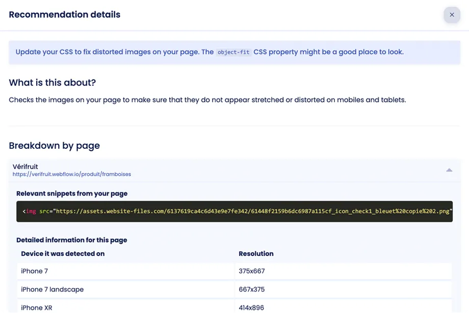
Thinking of all the possible devices and resolutions and designing with them in mind can be tricky, but designers and developers today do a much better job at responsive design than they used to.

However, it's always possible to forget one little thing, and to have that cause horizontal overflows, image distortions, unreadable content, or other errors of the sort.

To prevent your users from having a bad experience on your site, you should have measures in place to make sure this doesn't happen.

Screenshot of an error report for a distored image in Koalati's platform.
You're right. So...

I guess you have a solution for those responsive issues?

How did you guess? Well, you're right!

Koalati's responsive testing tool automatically loads every page of your site on a multitude of different resolutions and aspect ratios, to ensure that those sneaky issues get caught.

If we do find anything, you'll get information about where the problem lies, and recommendations on how to fix it.

Cool! So...

Can I stop manually testing on mobile and tablets now?

Not quite!

Automated responsive testing doesn't completely replace manual testing: it merely complements it.

You should still browse your website on every type of device you support to make sure your design looks right, your content is accessible, and your features are functional.

If you don't have the devices you need to test manually, we recommend you take a look at BrowserStack to get access to a wide range of real devices to test on remotely from your computer.