Today, Beau 2.0 was featured on ProductHunt.
So first of all, congrats to the team at Beau for the hard work and the launch!
To give them some support, I decided to do a quality control audit of their new website, to see if I could find any issues or potential for improvement before too many people get to see the site by themselves and accidentally stumble upon bugs.
In this article, I'll dive into the different aspects of the sites where I detected some problems. I'll explain what's wrong, and most importantly, how it could be fixed.
Excited? Let's get started!
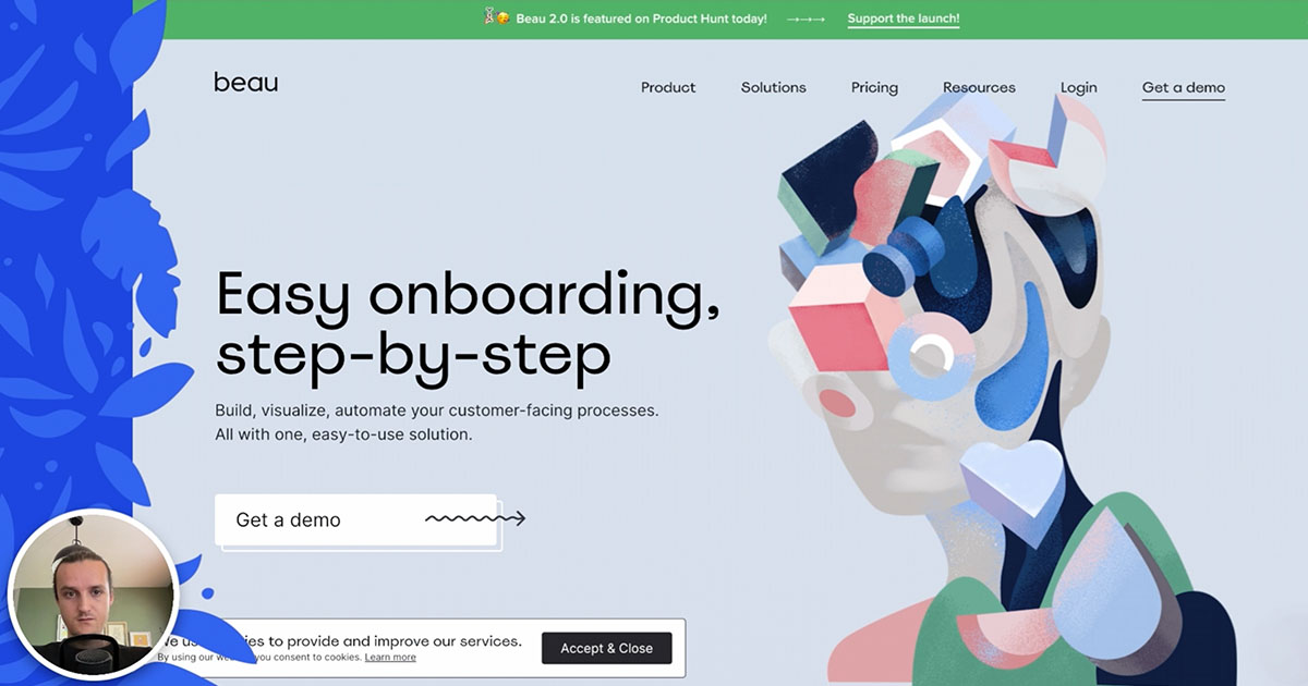
Design and aesthetic
There's no way around it: I have to start with the design.
Visually speaking, Beau's new website is very well crafted. The site is full of colourful illustrations, tasteful UI mockups, smooth transitions and animations, etc.
The page transitions, although simple, made the browsing experience much more pleasant.

Broken links
Now that the praises are over, let's take a look at the main issue we've discovered on the site during our audit.
Beau has a "Templates" page, which contains a list of templates that are available within their app.
While testing that section of the page, I found that although the featured templates work as expected, all of the search results' links are broken.
It didn't take much of an investigation to figure out that this was due to a Javascript error, seeing as the URL for these search results all contained undefined where they should have the template's name.
Other than that, we haven't found any other broken link on the site.
It is worth noting, however, that we couldn't use any broken link detection tools, seeing as the website is rendered in Javascript on page load (which isn't supported by most tools out there).
Open Graph meta tags
The next issue we found was with the meta tags Beau included in their pages.
Instead of using the property attribute (which is the expected standard) in their Open Graph meta tags, they used the native name attribute.
Therefore, Facebook's share debugger couldn't display the site's preview correctly, and neither could Twitter.
This might seem like a fairly minor issue, but website previews on social media platforms and messaging applications are very important. They are the main element that people look at to decide whether they'll visit a site or not, so you need to make sure that your preview looks perfect!

Duplicate meta description
In addition to the usage of the wrong attribute for Open Graph tags, I've noticed another issue which could hurt Beau's chances when it comes to website previews and search result appearances: the meta description is the same on every page!
The meta description is a good opportunity to improve SEO and website preview click-through-rate. But to get the most out of it, you need to take the time to craft a different description for each and every page.
At the moment, the description for every page is as follows:
Build, visualize, automate your customer-facing processes. All with one, easy-to-use solution.
This might be fine your homepage, but your "Accounting" and "Healthcare" landing pages aren't the same as your homepage — they cater to a specific audience. Your description should be updated accordingly.
Although Google may use text from a page to create a better description when the one you provide is too generic, it won't always do that. Plus, website previews on social media and messaging apps don't do that: they use the exact description that you provide.
To learn how to come up with good meta description, check out Moz's article on meta descriptions.
Loading speed
Overall, the site felt pretty speedy, even on my slow internet connection.
The use of large illustrations seems to have been balanced pretty well, with each image having a reasonable weight for the space they occupy on the page.
However, the images could still be optimized further. For example, running the homepage's hero illustration in Optimage compressed it by an additional 36%, with the file's weight falling from 447KB to 283KB. So if every image was optimized, they could likely shave off a few hundred kilobytes from most of their pages.
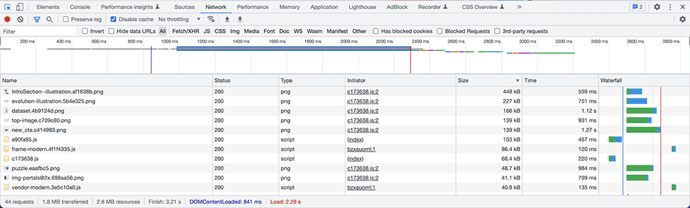
Additionally, they coud likely add a few <link rel="preconnect"> tags to help the browser initiate connections to external origins such as Google Fonts and Goole Tag Manager sooner, which could potentially shave off a few hundred milliseconds for the initial page load.
Accessibility
As I usually expect from most new websites, it doesn't look like accessibility was taken into account as much as it should have when developing the website.
Keyboard navigation is nearly impossible, seeing as the dropdown menus in the navigation can't be opened and the focus indicators haven't been tested.
Alternative descriptions are present on some images, but still lacking on many. Decorative images aren't marked as such (with an empty alt attribute), and some decorative images have a redundant alternative description (as they are followed by a label with the same text).
Semantic elements are used here and there, but not very intentionally it seems: many important landmarks are missing from the page, such as <header>, <footer>, <main> and <nav>.
Some links don't contain any text, which is an issue for screen readers and other accessibility tools. This can be fixed by adding alternative descriptions, aria labels, or even the title attribute (which is the least recommended approach out of the three).
Luckily for Beau, all of these issues could likely be solved in an hour or two if they decide to put in the time and effort. Lighthouse's accessibility audit, which Koalati can run on every page of your site automatically, can help you identify these types of accessibility issues very quickly.
Form error messages
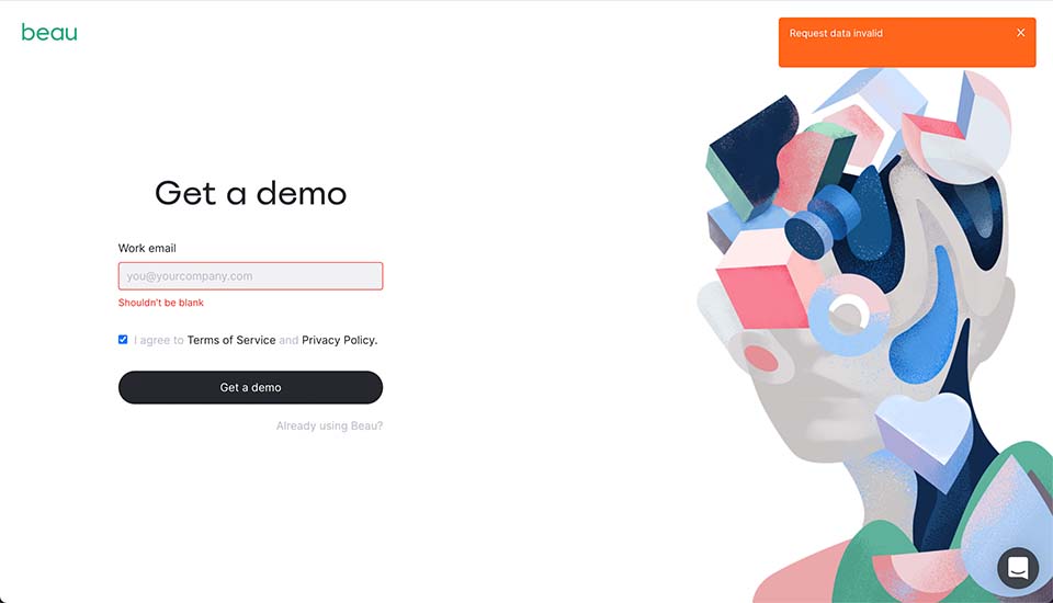
Just for kicks, I decided to test the "Get a demo" form. The form is pretty basic: it's just an email input and a checkbox field to accept Beau's terms and policies.
The form looked fine; the thing I had issues with was the form's error messages.
If you don't check the checkbox to accept the terms and policies, an error message appears as a bright orange toast notification in the top right of the screen for a few seconds to tell you that you must accept the terms. The message is clear, but having it disappear after just a few seconds is not ideal. Plus, it's very far away from the form itself, which is also not ideal.
I then tried to type in an invalid email address, or to simply leave the email field blank. In both cases, a nice error message was displayed right under the field. However, I didn't notice these message until 5-6 seconds later, because a bright orange toast notification appeared in the corner of my screen again and caught my attention first. This time, the message was not helpful at all: it just said "Request data invalid".
This, my friends, is an error message written by a developer. No doubt about it!
To improve this form, here's what I would suggest:
- Remove the toast notification: it's noisy, and its ephemeral nature isn't adequate for a form validation error.
- Add an inline error message for the terms and policies: this will improve consistency between the different validations.
- Add a loading indicator: the user should be informed that something is being processed when they submit the form. Currently, there's a slight delay and then an error (or a success message) appears, without any feedback in between.
To better understand the context and the interactions in this section, check out this short form validation clip from the audit.
Error pages
Although the rest of the website has been designed with care and attention, it looks error pages have been either ignored or forgotten.
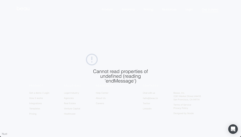
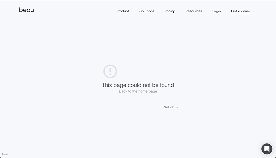
Both the 404 page and the 500 error page are dull and gray. They both use the wrong font for their error messages. They both have a link to NuxtJS's website, with the label "Nuxt", which makes me think they might be using be Nuxt's default error page template.
Seeing as landing on an error page is one of the least exciting (and potentially one of the most frustrating) experiences one could wish for, these pages should be designed to make the user smile and to guide them towards what they're looking for.
To me, error pages are an opportunity to have fun with the design. So with that in mind, I'm sure Beau's team could make a hell of a good error page, seeing how creative they have been on the rest of the site.
Other minor issues and recommendations
During our audit, we had a few more suggestions for Beau's team:
- The search bar for the templates section should likely search for templates matching every part of the search query, instead of attempting to match the entire search query as a whole. Check out this short clip from the audit for more details.
- The search results for the template search feature doesn't have an empty state.
- The layout and alignment of elements on tablets felt a bit weird and unnatural. Compared to how nice the desktop's design was, some pages felt subpar when browsing on iPads.
- The external links in the main navigation don't have any indicators to say that they are external links. It might seem dumb, but the lack of indicator confused me a few times when I did click on the links.
- The links in the footer could be differentiated a bit from the footer's non-clickable elements (ex.: different colour, underline, etc.)
- The purpose of the site isn't necessarily obvious, unless you already had an external source of context (ex.: Google Search query and/or results, Product Hunt listing page describing the product, etc.). The term "onboarding" could potentially refer to different types of onboarding (employee, customer, software users, etc.), and without context clues, it can be a bit difficult to grasp which one the app helps you with at first.
Summary
Beau's new website looks good, loads fast, and has an artistic style that really drives you in.
But like many new websites, it could benefit from a well-researched and executed quality control process.
In our audit, we found:
- broken links;
- responsive issues;
- accessibility issues;
- incorrect OpenGraph meta tags;
- form validation inconsistencies;
- ... and a few other minor issues and annoyances.
Still, many of these issues could be fixed in just a few minutes; none of them are so complex that they would take hours upon hours to fix. So let's hope they take those recommendations and use them to improve their website.
Congratulations to Beau for their new website!
Although Koalati receives a percentage of the purchases made by visitors who follow one of our affiliate links, this is not a sponsored post. The companies and products that are presented, linked to and/or endorsed in this article are there based on merit, on product research by Koalati, and by our experience. As an ethics driven company, we aim to inform and help our visitors and users to the best of our ability, without bias or external incentives.