Have you ever accidentally bought something because it had been added to your online cart automatically? Or accidentally subscribed to a product on Amazon instead of just buying it once? Well, it's likely not your fault.
Many companies are using design to trick and manipulate users into doing things they otherwise wouldn't. These insidious design practices are often referred to as dark patterns.
In this article, we'll tell you how and why people use dark patterns. We'll also explain why you should avoid using dark patterns when building websites and applications.
Ready? Let's dive in!
What are dark patterns?
Dark patterns are tricks that make people do things they never intended to do.
This is typically done by designing a page or an interface in a way that hides information that would make the user change their mind. Other variants use confusing language or design to make it very difficult for users to understand what they're about to do.
Here are a few common examples from well known companies that you might have encountered before:
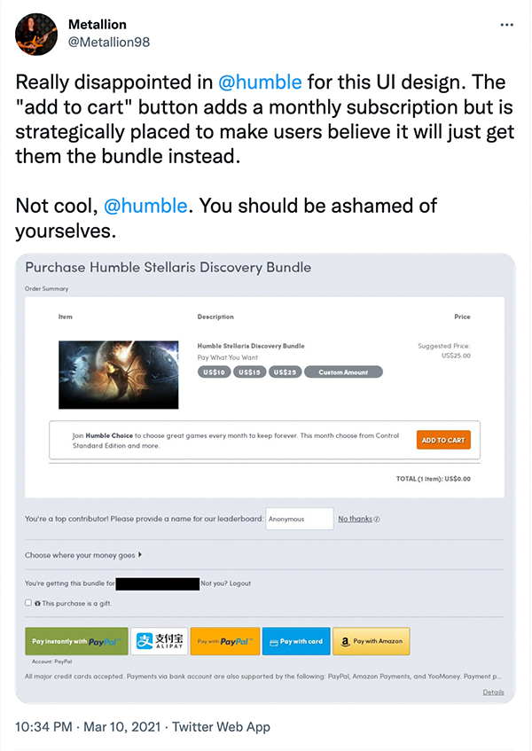
- Adding a product or service you didn't need to your purchase when buying something online.
- Showing a promotion and labelling the cancel button with "No, I don't like savings".
- Showing fake countdown timers or low stock warnings to push you to buy right away.
- Sharing something to all of your contacts without warning you beforehand.
- Making it incredibly easy to subscribe to a service, but very difficult to unsubscribe.
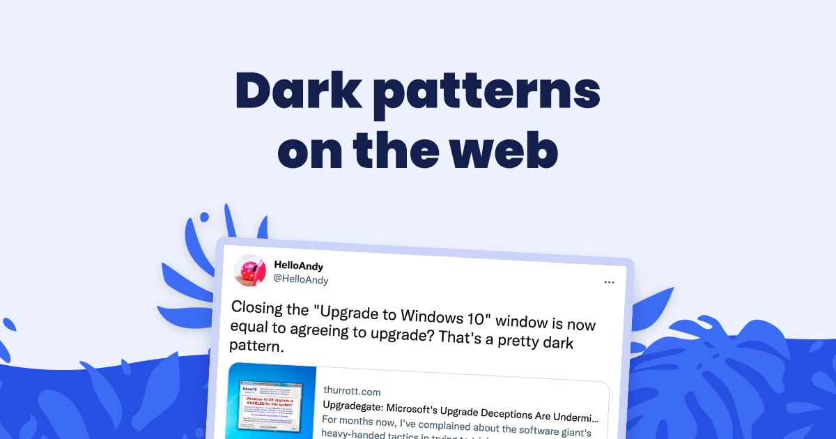
And these are just a few examples. There are a lot more instances of dark patterns out there on the web, ranging from mildly annoying to infuriating and illegal.
Harry Brignull, the UX specialist who coined the term dark patterns over a decade ago, lists 12 types of dark patterns on his website DarkPatterns.org. He also lists real examples of dark patterns from just about every company you can think of in his Hall of Shame.
So, now that you have a basic idea of what dark patterns are, you might be wondering...
Why do people use dark patterns?
If dark patterns are so bad, surely people don't use them anymore, right?
Unfortunately, that couldn't be further from the truth.
As annoying and immoral as they may be, dark patterns have one "good" thing going for them: they "work".
Sure, forcing your users to add products they don't want to their cart is going to increase your sales of that product. It's also going to increase your overall sales numbers, seeing as so many people are gonna be buying more stuff! Great stuff, right?
If you're an analytics person, the increase in conversion rates and customer value you'll notice after implementing dark patterns will seem very attractive. And if you're not an analytics person, there's a good chance your boss is, and they'll be more than happy to learn that business is doing well! Heck, you might even get a promotion for driving sales so much! Great job!
Except... it's not quite that simple.
When we say good patterns have a "good" thing going for them, and that they "work", it's meant to be taken with a grain of salt. And a rather large one, at that.
Although dark patterns often increase your numbers in the short term, the positive is often outweighed by the negative impact they have on your users and on your brand. They reflect a severe lack of respect towards your customers, and to put it bluntly, they make you look greedy.

Why you shouldn't use dark patterns as a developer or designer
Do you remember how you felt the last time you experienced a dark pattern?
For many, annoyed, irritated, or infuriated are the feelings that come up. Feeling dumb or exploited after having been tricked by dark patterns is also common.
As a web creator, the last thing you want is for your users to have bad experiences with your app or website. Bad experiences lead to a drop in user satisfaction, which in turn leads to bad reviews and tarnishes your brand's image and reputation.
Plus, the usage of dark patterns reflect a severe lack of respect towards your customers. It's a small indicator of greed that makes people think twice about what your values really are, and whether they want to support you.
Manipulating users through design can also be seen as a sign of more important moral issues within a company. "If they're willing to trick users like this, what other unethical things are they doing behind the scenes?"
Big companies with huge user bases may be able to afford damaging their reputation for the extra profits, at least in the short term. But remember that placing profits and conversion rates before user experience and satisfaction has led to the demise of many Internet businesses. People are very vocal about their bad experiences, and when others relate to it because they've experienced it as well... things turn sour and spiral out of control very quickly.
So, to recap, you should avoid using dark patterns because:
- Dark patterns are unethical;
- Dark patterns are hurtful for your users;
- Dark patterns damage your reputation;
- Dark patterns can get you a lot of bad press.
Cennydd Bowles summarizes it rather elegantly in his article If you think all design is manipulation, please stop designing:
Design influences. It persuades. But if it manipulates, something’s wrong. The difference isn’t just semantic; it’s moral. A manipulative designer abuses their power and strips people of their agency, reducing them to mere pawns. I see almost no circumstances in which that’s ethically acceptable.
Cennydd Bowles
Head of responsible design and innovation studio NowNext
Watch out for accidental dark patterns
Many companies use dark patterns on purpose to boost their profits.
However, some developers and designers actually implement them accidentally. By focusing on creating interfaces that convert, or flows that retain users for longer periods of time, they don't notice how blurry the line is getting between "what converts best" and "what's disrespectful towards the user".
This may seem unlikely, but it's more frequent than you may think.
When designing something, you're often having to juggle two different sets of priorities that sometimes go against one another:
- What's best for the users?
- What's best for the business?
If you don't think about the business at all, there's a good chance it will fail. But if you don't think of the users at all, the business is almost certainly going to fail.
So to avoid accidentally creating bad experiences with dark patterns, remember the following:
- Always think of the user's needs and goals first when designing an interface or a process.
- If you're hesitating between an implementation that's better for the business versus one that is better for the users, always go for the latter.
In the end, however, it's important to remember that everyone makes mistakes. If you're always doing good by your users and then a dark pattern inadvertently finds its way to your website or application, your users will let you know - you can then apologize and address the issue.
An ethical alternative to dark patterns
It boils down to two words: guidance and transparency.
- Make the information as clear as possible;
- Guide your users through their decisions and processes
- be helpful and transparent
Being transparent and guiding your users to do what's best for them is unlikely to get you as many "easy sales" in the short term.
However, it shows to your customers that you care about them. That you're in the business of helping people — not ripping them off. And that's much better for you in the long term, especially for your customer's satisfaction and your brand's reputation.
How can I avoid getting tricked by dark patterns as a user?
It's hard to avoid falling into the traps laid by dark patterns, because some companies are dedicating a ridiculous amount of resources into actively trying to trick people like you.
However, you can counter most dark patterns by:
- Being extra vigilant when filling forms or checking out;
- Watching out for the fine print.
Other than that, you can help by taking a stand against websites who use dark patterns by not buying from them (or visiting them). It may not seem like much, but negatively affecting their profits and their conversion rates are much more likely to drive change in such a company than trying to fix their moral compass.
If you do notice a dark pattern, we suggest you share it with @darkpatterns on Twitter so they can add it to their Hall of Shame and share it with others on social media in order to pressure the company to address the issue.
Resources on dark patterns and ethical design
If you're interested in learning more, here are a few resources and articles you might find helpful or interesting:
Summary
Dark patterns are tricks that push users to do things they don't want to do.
Although they might boost your numbers, they should be avoided because:
- they are unethical and immoral;
- they negatively affect user experience;
- they indicate a lack of respect towards customers;
- they tarnish your brand's reputation.
Although Koalati receives a percentage of the purchases made by visitors who follow one of our affiliate links, this is not a sponsored post. The companies and products that are presented, linked to and/or endorsed in this article are there based on merit, on product research by Koalati, and by our experience. As an ethics driven company, we aim to inform and help our visitors and users to the best of our ability, without bias or external incentives.